I analyze macroeconomic issues from a fundamental perspective, and I analyze market behavior from a technical perspective. Original macroeconomic analysis can be found here and both macro analysis and commentary can be found on my Caps blog. If you like or appreciate my analysis, please add yourself to my Following List

Monday, November 30, 2009

Messy Day

What a messy day. Still building off my primary count (There is No Better Breakfast than Pumpkin Pie and Midnight Black Coffee and follow the links back). Friday and today look very zig-zaggy to me.

Another View of Risk

Like I was mentioning in my last post (A Look at a Few Gold Ratios / A Few Words on Risk), the risk environment is rising.

And this shows up on many other measures besides gold. Look a comparison of the Dow ("safe" blue chips) vs. the Russell 2000 ("risky" small caps), and tell me in a straight face that risk is low and it is safe to be bullish.

Well, I am just going to go ahead and show you.


Keep buying those dips! /**heavy** sarcasm/

A Look at a Few Gold Ratios / A Few Words on Risk

I have talked about gold ratios and their importance several times in the past (The Gold Blog. Gold/Silver/GSMs (and a little Oil for good measure), Thoughts on the Dow/Gold Ratio, etc.). It is important to look at the performance of asset classes not only in nominal terms (all US assets are bought and paid for in Federal Reserve Notes (aka the US Dollar) and so everything has an exchange rate whether you are consciously aware of it or not. e.g. 1150 FRNs (or $) / Maytag Neptune Front Load Washing Machine (item)) but in terms of other currencies (765 EUR / Maytag Neptune Front Load Washing Machine (item)), most especially gold (1oz Gold / Maytag Neptune Front Load Washing Machine (item)).

If you don't think gold is a currency, then stop wasting your time reading this post.

Gold is a very important unit of monetary measure (I will not go into a big diatribe here. I have covered this many times already as have many other bloggers and writers). Most specifically gold:

1) Is the longest lived currency in history
2) Is a non-inflating currency (new mining supply adds very little to the above ground supply, on the order of 0.5%-1.5% per year)
3) Gold is a safe haven asset. It doesn't pay dividends, it does not multiply. It holds value. It protects wealth. As such when risk is high / confidence in the financials markets is low gold historically outperforms

And guess what gold is doing right now :


Yep, you bet. It is outperforming.

What does this say for the risk of most asset classes right now? Gold stars to everyone who said that risk is high.

And this shows up on many other measures besides gold. Look a comparison of the Dow ("safe" blue chips) vs. the Russell 2000 ("risky" small caps), and tell me in a straight face that risk is low and it is safe to be bullish.

Have fun.

Another Weird Start

Much like what happened a few weeks ago (see this post Count-o-rama) the Russell and Financials are headed in completely opposite directions. This time for 20 minutes.


... Things are starting to break down unexpectedly again

Sunday, November 29, 2009

If I had a NIKKel for ....

Wow binv, those are some really bad puns you are coming up with.

I showed my long term NIKKEI count back in September (Long Term Count of NIKKEI), and last week I showed a chart update on several Asian indices (Another Look at a Few Asian Markets).

I want to continue this train of thought with the NIKKEI. Here, first is the long term chart for reference, with the accompanying notes from my last Asian post:

Next is the old NIKKEI. Ouch. The long term chart tells the story of this Blue Supergiant, which burned so hot and so bright for decades, and is continuing to implode after fusing all that hydrogen into helium.

It has been leading down recently. And I think a lot of this has to do with the "carry trade" baton being handed from the Yen to the Dollar. So a fair question is, what happens to US markets when the carry trade gets handed off to somebody else? (Treasury Bond rates are a balloon being held underwater, but I certainly don't argue that rising rates will make the Dollar healthier. Far from it. Just more expensive. Riddle: Is a more expensive worthless dollar still worthless?")


So lets zoom into the daily chart. Just as the indicators were signaling a bottom back in 2008/early 2009, they look to me like they have been signaling a top as well. The NIKKEI has not made a higher high since August.

The long term count above shows a 5-wave move down with the NIKKEI starting its 5th wave. Since August the move does does not look like, nor does it count like a clean impulse. But you can see on the notes below, it does look and count like a leading diagonal feeding into a larger leading diagonal.

Columbia has been doing some *excellent* work in comparing leading / lagging major indices and has been using the NIKKEI has a leading indicator. This is well worth checking out: Follow the Leader?

The big question is, how does it handle the large support area it finds itself on right now? I don't have an answer to that question. But I see 2 main possibilities

1) It ignores it and breaks down definitively. This means the second leading diagonal doesn't really exist. However, if you look at the indicators, they are already oversold. So a breakdown here will get a bit of a run, but I doubt it will be a "crash"

2) It respects the support and bounces up. However this would be a classic technical bounce to burn off oversold. The bearish implications in this scenario are much more severe. The indicators have already shown significant bearish divergence earlier this year and I am showing below a potential Head and Shoulders setup of massive proportions. This would be a very big deal

So either way, other than for *very short term trades* the NIKKEI chart looks very bearish to me.

Friday, November 27, 2009

HSI...I...I...I am appalled

Like I was observing a few days ago in my last post on Asia (Another Look at a Few Asian Markets), there have been a lot of "un-bullish" developments on the charts.

I was observing that the Hong Kong Hang Seng (HSI) was in an ending diagonal. Well the last 2 days proved very un-bullish indeed. HSI is a mixture of Asia and Financials, and both are getting hit pretty hard in the crotch recently.

Looks like a diagonal breakdown to me.

Keep buying those dips!

There is No Better Breakfast than Pumpkin Pie and Midnight Black Coffee

I hope all of you had a wonderful Thanksgiving!

Action today --- wow. I will not comment on all the Dubai observations already made. They have been documented ad naseum already.

I am still sticking with the preferred count of mine that I have been consistently showing the last several weeks (see my last post, My Turkey is Brining Happily, oh yeah, What's the Market Doing?, and follow all the links back).

There has been a lot of noise that this is the start of P3 based on Prechter's / EWI's 200% short call. (I am not an EWI subscriber, but enough people have been talking about that one).

The only thing I have to say about that ... maybe. I don't like the count for it, especially that a lot of other bloggers show in how we get to the end of P2. But it is a possible count.

The only P2 done count that I really like or find compelling is Columbia's

Most of the P2 count's (other than Columbia's) has:

1) A plethora of BS running flats (which are, IMO, by and large fictitious)
2) Some oddly placed / contrived very large X wave after July
3) Some BS expanding ending diagonal as the final move

Columbia's count and my count are nearly identical. We differ by only 2 waves. He treats the mid-August move as a running flat but unlike other bloggers has a very well-reasoned approach that is indicator based to show why that structure does not behave like the others. However, I still count them as separate waves.

So I watch Columbia's count very closely, and I would suggest that you do the same.

Anyways, here is my count. Still think this is a very volatile Minor B wave and we are working on Minute C of Minor B (and no I do not think it is done yet, but I have yet to find any compelling count that I like in the last wave):


Thursday, November 26, 2009

Happy Thanksgiving!

Happy Thanksgiving to all of you. I am very thankful to be part of such a great community. The readers and contributors on this blog give phenomenal insights and observations. The same is true of all of the blogs on my link list and the Goodvibe Lounge. I am grateful to be charting these un-navigated waters with all of you!

Thank You and have a Happy Thanksgiving!!

Wednesday, November 25, 2009

My Turkey is Brining Happily, oh yeah, What's the Market Doing?

Still continuing with my preferred count that I have been showing consistently over the last several weeks. In my last post (If I Had to Guess) I showed a guess as to how Minute B of Minor B would play out (http://1.bp.blogspot.com/_OpW...). And it extended a little longer than I thought, but otherwise a pretty good guess for a very confusing b of B wave (which notoriously defy prediction).

Here are my counts and my adjustments to how I see Minute C playing out given the price action of the last few days:


Another Look at a Few Asian Markets

I have written several posts in the past looking at Asian stock indices (Long Term Count of NIKKEI, HSI Long Term P/E Analysis, A Look At Some of the Asian Markets, and several others).

And it is worth re-examining as the Asian markets have led the world stock rally. They were the most oversold and hence were the earliest receivers of speculative money. It is a reasonable hypothesis that money will leave them first as well. This is a point I have made several times in the past, and have had conversations with other bloggers (such as Alphahorn) along these lines.

So some of the "hot" markets that aren't looking so hot right now are the SSEC, KOSPI and HSI. The HSI is definitely holding up better, but the SSEC and KOSPI have both retested major resistance levels and both have been "rebuffed".

Next is the old NIKKEI. Ouch. The long term chart tells the story of this Blue Supergiant, which burned so hot and so bright for decades, and is continuing to implode after fusing all that hydrogen into helium.

It has been leading down recently. And I think a lot of this has to do with the "carry trade" baton being handed from the Yen to the Dollar. So a fair question is, what happens to US markets when the carry trade gets handed off to somebody else? (Treasury Bond rates are a balloon being held underwater, but I certainly don't argue that rising rates will make the Dollar healthier. Far from it. Just more expensive. Riddle: Is a more expensive worthless dollar still worthless?")

I digress, here are the charts.


Tuesday, November 24, 2009

If I Had to Guess

And of course, I am. I still think we are in Minor B (see last post Now That's What I Call VOLATILE! :)). Gumbo and Kevin and I were discussing whether this was a 4 of 5 of A or b of B. I maintain and still think this is a b of B.

Even though breadth was 10:1 yesterday, it did not have the commensurate volume. I remarked that the volume yesterday was unimpressive. That doesn't mean that it was necessarily low, it meant that I would have thought very differently about that wave if it was 10:1 breath on exceptionally high volume. But it wasn't, so I still maintain that is was just a volatile Wave B spectacle. Just like the last Wave B we had (see the link above for more on those observations).

Current count. Still building off of the same preferred count that I have been showing consistently for the last few weeks.


Monday, November 23, 2009

First and Second Derivatives of the SPX

Here is another off the wall post that will produce a few more interesting
observations. Please see my last post Recipe for Disaster to see where this train of thought came from and I will be linking some conclusions together between this post and that one.

First, what the hell is a derivative?

Maybe you are familiar with this concept on calculus and maybe not. Here is the real background if you are interested (http://en.wikipedia.org/wiki/Derivative), but here is the 1 paragraph version that gives you an understanding for this post.

A function is a description of how a dependent variable (lets call it y) moves with respect to an independent variable (lets call it x). A straight line is a very simple example: y = slope*x + intercept. Or a parabola: y = x^2. A derivative tells you the instantaneous rate of change of that function as x changes. It is also the slope of the function, but rate of change is the key concept. A straight line is always changing at a constant value, hence its derivative is a constant number. The parabola has a negative slope for x < 0, has a slope of zero at x = 0, and has a positive slope for x > 0. The second derivative tells you the rate of change of the first derivative.

Okay, that was a bit abstract. So lets use a physical example. Position (or displacement) as a dependent variable tells you where you are with respect to time, the independent variable. The first derivative will tell you the rate of change of position with respect to time. This is the velocity, or speed. Everybody is familiar with this concept. The second derivative will tell you the rate of change of velocity with respect to time. This is the acceleration. Another familiar concept.

Now lets apply this concept to the stock market. I will specifically be using the S&P 500 here. The price is analogous to the position, and we will look at the first and second derivatives of price, to help us to understand the behavior of how the price is changing with time.

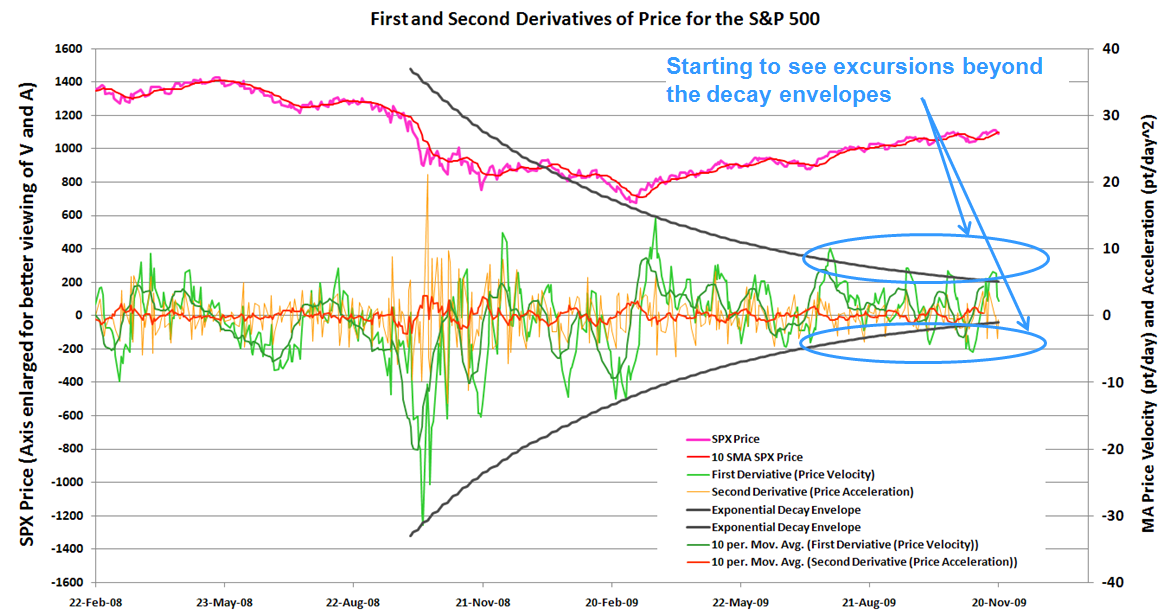
First, here is the chart:


The price of the SPX is at the top of the chart in pink (I adjusted the left axis so the price would reside above the velocity and acceleration curves so that the chart would be more readable).

I did not calculate the velocity directly from the price action. It is too chaotic and would give just a big mess. So I calculated the 10 day Moving Average of the price (based on closing prices) and determined the velocity of that curve. For an additional bit of "smoothing" I am also plotting the 10 day MA of velocity just so the trend is a bit clearer, but I am working with the velocity as described above. The acceleration is calculated directly from the velocity, but I am also plotting a 10 day MA for the acceleration so you can see the trends (since it is also very spiky)

As a side note, the ROC (rate of change) indicator on Stockcharts gives you very similar "velocity" information. I am showing the data plotted myself since I am going through a more in depth study.

Important observations: The middle of last year was the market crash. This is by far the most important price action element on the 2 year chart. The move down was a violent freefall and you can see the associated velocity spike.

When I think about this move and try to assign it a physical corollary, I think of a football kick. A football is initially at rest and then the kicker kicks the ball to put it on its parabolic trajectory toward the goal posts. But what is of interest here is the dynamics and forces right at the time of the kick.

This system can be modeled as a first order Ordinary Differential Equation with a prescribed velocity as the initial condition. And for those who have done first order and second order ODE modeling of physical processes, the disturbance perturbs the system which has natural damping to return it to an equilibrium position. The response is always an exponential function (e^-j*omega*t) or (e^-omega*t) depending on if you are underdamped or overdamped.

The point is that an exponential decay envelop tells you how the response will change over time. And so when when I look at the velocity, I am able to fit an exponential decay envelope very nicely over the peaks.

This works very well describing the velocity behavior from mid last year to mid this year.

The last couple of months up to Now is where things get very interesting.

So for a physical system, the vibrations damp out to zero as time increases. And for very big disturbances, I would expect the market to behave like a physical system (it has mass, inertia, capacitance, etc. Tastylunch and I have had long conversations about this http://caps.fool.com/Blogs/ViewPost.aspx?bpid=127072, comments #39-43). The are places where these analogies do not work, but you can get a surprising amount of insight into monetary policy effects and assets price responses if you look at them as signal functions.

So the current large wave up (Primary 2) is a mechanism by the market to dampen out the oscillations caused by Primary 1 (the wave down last year). And from the decay envelopes above, you can see it was doing exactly that. But now the oscillations have begun to increase again. They are no longer being held in by the decay envelope.

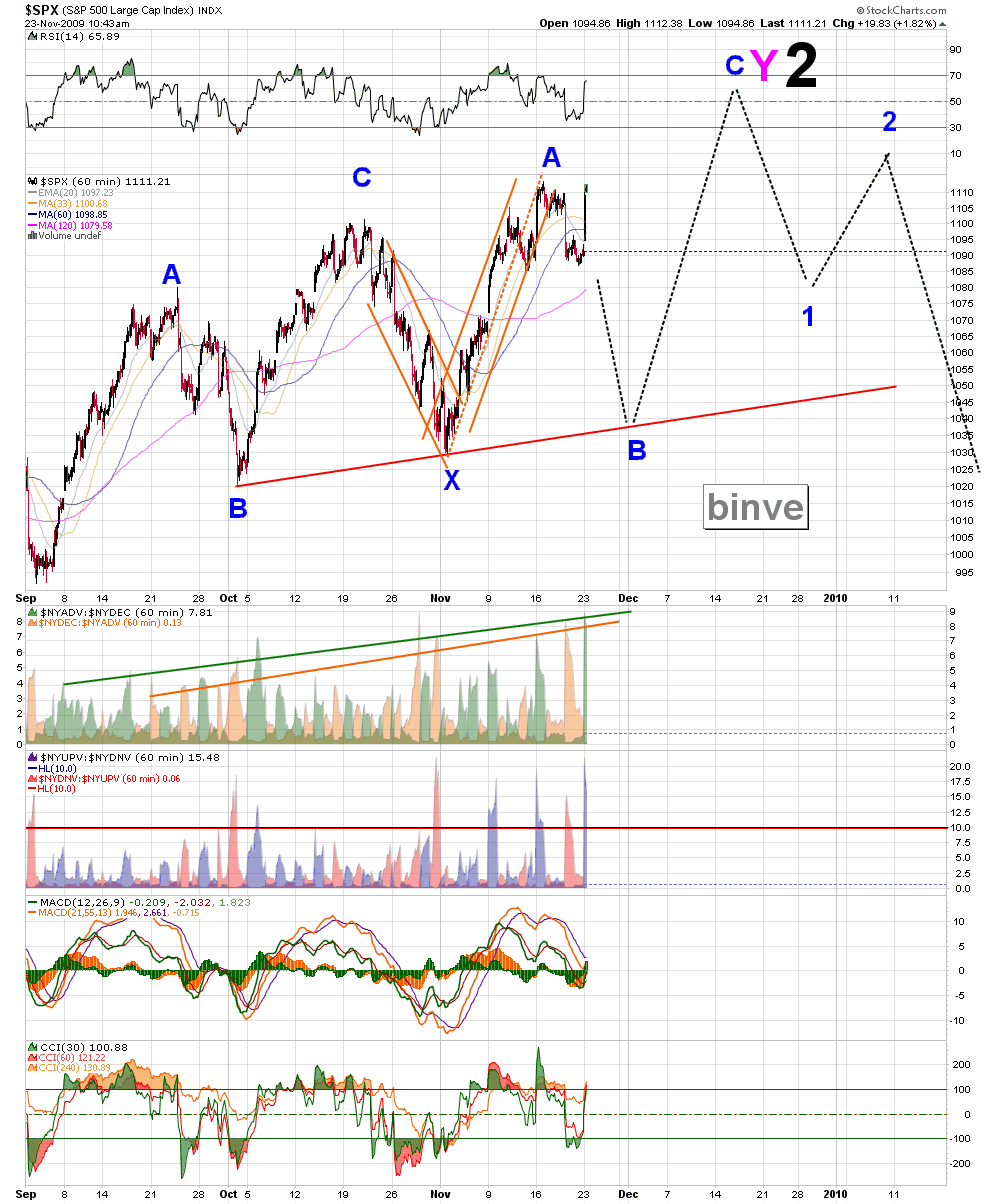
And this goes directly to the observations that I made in my last post Recipe for Disaster. The market internals (and breadth is by far the most important internal measure) are becoming more violent up and down even as the price action narrows and starts going sideways / slightly up as it has the past couple of months.

This lets you know that there is a lot of turmoil beneath the surface and another large "step function" in price change is about to occur. Will it be a crash up or a crash down? I obviously have my opinion on the matter. For those who are interested in my opinion, please read this post: My Positions and Projections

But the real point of this post and the last post is to show that things are not as calm as they might appear on the surface.

Recipe for Disaster

I have worked a bit with Control Systems. I am by no means an expert. But the market right now looks to me exactly like an unstable control loop. For a little background on what I am describing, please read this post Why e is the coolest number and especially read the part at the end regarding LaPlace Transforms and integral convergence with respect to control systems.

But let me distill down a few concepts in controls. The first is a feedback loop. Whenever you have an input into the system (such as the the control stick to move the ailerons on your airplane), you want the actuator and the system to respond in a stable way. By this I mean when you move the stick to bank left or to pitch down, the actuators controlling the ailerons should move in a way that causes that movement and nothing else. They are two big exceptions that occur that cause big problems that aircraft designers need to avoid. The first is aileron reversal. This happens when the flutter speed is exceeded and the control surface (aileron) no longer can maintain aircraft orientation. Below the flutter speed the controls work normally, near the flutter speed the ailerons do not respond to inputs. Past the flutter speed the ailerons go into reversal, which means that a left bank on the control stick turns the airplane right. This is a catastrophic scenario to be avoided in the operating regime.

The next is oversteering. This is when your control surfaces give you too much movement and don't return to an equilibrium state on their own. If you pull up on the controls and the aircraft pitches up much more than you intend and you overcompensate by immediately pitching down, and again the controls are too strong and the aircraft pitches down too much. This is an example of runaway positive feedback. I saw one a video of a pilot landing an experimental aircraft that had exactly this problem. The ground effect as the aircraft was coming in for a landing was overwhelming the controls a producing a positive feedback. The aircraft oscillated wildly up and down just a few feet off the ground before crashing and skidding on the runway. Fortunately the pilot was safe.

The point is that control systems must be defined very carefully and that runaway positive feedback is detrimental to a control system.

And we are seeing perhaps some runaway feedback in the market right now. The bulls are getting uber-bullish and the bears are getting uber-bearish. On each large wave down bearish breadth is increasing, and on each bullish wave up bullish breadth is increasing. This has been happening over the past few months and prices are mostly sideways / slightly up. See the chart below. Look at the breadth right below the price (green and orange curves with the green and oragne trendlines)

How does this resolve itself. One word .... badly.

Now That's What I Call VOLATILE! :)

Wow.... yep. The last few days have been a spectacle. That that's exactly what B waves are, volatile spectacles. Don't believe me? Did you look at the last B wave that we encountered, back in late September / early October? (See this chart: http://3.bp.blogspot.com/_Op...)

Anyways, per my last post Predictions for Minor B I said that Minor B would be volatile and that the b of the B would be *very* volatile. Gumbo remarked that trying to trade this Minute Wave would be like getting chopped into hamburger, and I couldn't agree more :). I mean we have 10:1 bullish breadth on volume that is fairly unimpressive. This thing is going to whipsaw like crazy the next few days. Wait to establish your next positions until something more clear takes shape. My $0.02.


Friday, November 20, 2009

Predictions for Minor B

We completed Minute A of Minor B per my count. I have a several posts that I have written over the last week that detail how I came to this count and called it before the drop (Is Minor A Done?, Count-o-rama, Short Term Projection, Pattern Chart, EOD Overlay Chart, B is for ... Bacon?, and B is for ... Bears, Beets, Battlestar Galactica).

So I think the next few days will be in a very volatile Minute B wave. If you didn't already establish your short positions, trying to find a good one in here ... well, good luck to you (I am happily in TZA and FAZ at the moment that I established most recently last week. Please see this post for a good summary for my near and long term projections and my positions My Positions and Projections)

Also, before you see the counts, did you check out my late night post last night? Important Bearish Chart of the Day: NYAD

Here is how I see the next few weeks / next couple of months shaping up based on my wave count (to understand my Primary 2 count, see this post Projections, In the Corner of My Mind)


Also here is how My Big Fat Crazy Dollar Prediction is shaping up and how it compares to my wavecount with the market (see how the dates line up). Will it play out like this? Who knows, but you have to have some plan to trade off of, so you might as well make it a crazy plan. Those are the only ones that seem to work nowadays :). And of course, to see the full context of my P3 and long term Dollar predictions, see this post: Thoughts on the US Dollar, Analysis of the USDX Long Term, Follow up on the Gold Blog


Edit Nov 21 - 11:00. Revised the 2 count based on a valid criticism by Jay_J. Added the long term count also (which I have shown before) to put my 2 year count into perspective


It's Time to ... Jitterbug?

No, you fool, polka!!

Columbia called this just now in the CIL and I believe he is right on. Awesome spot Col!!

We have an ending diagonal for the C wave. We should get a reversal up soon.

It's Time to ... Polka?

No, wait! The Jitterbug! Ahhhhhh!!!!!!!

Still building off the same count from the last several posts (Is Minor A Done?, Count-o-rama, Short Term Projection, Pattern Chart, and EOD Overlay Chart). I think we are in a Minor B wave. And as I have said probably the hundredth time now, B waves will be very volatile.

From my post yesterday (B is for ... Bears, Beets, Battlestar Galactica) I was calling for a down day today to finish out Minute A (orange) with one more Minuette C wave (green) to complete it.

So far that looks like what we are getting. Let's see how this develops.


Important Bearish Chart of the Day: NYAD

I was perusing my charts this evening (I literally have hundreds in several directories... sigh) and found an interesting / important development on major one: The NYSE Cumulative Advance Decline (NYAD)

On all my microcharts, I show (at the bottom) NYADV:NYDEC in green and the inverse in orange to show the breadth that day. But looking at a cumulative plot of the NYAD show how the breadth is increasing (or decreasing) as a trend as the price move wears on.

And breadth as a whole is not confirming this higher high the past week in the market.

Which makes perfect sense. So many of us bloggers have been been talking about how fractured the market is right now. The difference between the Russell 2000 and the Dow just jumps off the page. This is an obvious sign of risk aversion. There is a huge risk spread (the difference between the "safe" Dow and the "risky" small caps of the Russell). If the atmosphere was really bullish, shouldn't small caps be outperforming?

Anyways, the NYAD (orange line in the chart below) failed to make a higher high as the SPX (pink line) and the Dow did.

Thursday, November 19, 2009

B is for ... Bears, Beets, Battlestar Galactica

I would like to show my EOD counts as well as to compare the prediction from my EOD count yesterday vs. what unfolded today and the prediction for the rest of today that I made at 1:30 vs. how the rest of the day played out.

First - EOD yesterday

This was my count and prediction from yesterday afternoon's post (EOD Overlay Chart). It shows a sharp A wave down in the morning followed by a B wave up the rest of the day:


Here is what took place today:


.... Not bad!!

Next - 1:30 pm today

I said that we had a A wave down this morning, and B would trace out a complex wave from the rest the of day with a Subminuette C wave rally into the end of the day. From: B is for ... Bacon?


And how did the rally turn out?


... Again not bad! I picked the end of Subminuette B a little too early, but otherwise a pretty nice prediction.

Now I am not trying to toot my own horn .... well, wait a minute. I guess I am tooting my own horn. "Toot! Toot!". When old blind squirrel binve finds a nut, it's cause for celebration! ... :)

B is for ... Bacon?

Mmmmm..... bacon.

Still building off the same count from the last several posts (Is Minor A Done?, Count-o-rama, Short Term Projection, Pattern Chart, and EOD Overlay Chart). I think we are in a Minor B wave. B waves will be very volatile. Here is a quote from my post Count-o-rama:

This note has been on my 5 minute chart for several days: "Next wave is a B by my count. Expect a lot of confusing up and down action, that generally trends down" ... yep, I think that describes the situation pretty accurately.

Yesterday we has some classic B wave action, very strong on the Dow, almost made a new high (maybe it did) yet that same wave looked completely weak on a number of indices. Then this morning the Russell and XLF were moving in completely opposite directions for about 12 minutes.

These weird moves and non-confirmations are classic in B wave territory.

So that is my thought and my bet.


So this continues to be my thought and my bet


My Positions and Projections

---> Positions/Portfolios

BIG PICTURE


Public Portfolios for binve and Market Thoughts and Analysis

First and foremost:

These portfolios are *NOT* meant as trading advice in any way, shape or form. They are meant as an illustration of some of the trading tactics that I employ when I use and trade off my own charts. They are representative of my trading style and do not indicate any particular real life portfolio. Moreover, as illustrative tools which are *NOT* trading advice, I will not offer any tailored trading advice associated with these portfolios or in any other form. The links provided below communicate the implementation of trading strategies and should be used only for learning / illustrative / entertainment purposes only

That out of the way, here are a few public portfolios that may be of interest to blog readers

1) MTaA public portfolio

This is a simple spreadsheet that I use to track trades (mostly medium term swing trades). This one most closely represents how I actually trade, and how I use / implement my charts. It is kept *very* simple for bookkeeping purposes (no commissions or margin) and is representative only. It is a public spreadsheet available for viewing

---- MTaA public portfolio

2) Wall Street Survivor (WSS) Portfolio

Swing trading portfolio using the WSS platform. Click on the "Permanent" portfolio tab (not the 100K or Options tabs), this is the portfolio that I use.

---- MTaA WSS porfolio - binve^jwt

3) UpDown (UD) Portfolio

Swing trading portfolio using the UpDown platform. I like the Updown interface more than WSS, but it tends to crash / hang-up *a lot*.

---- MTaA Updown porfolio - binve

4) Motley Fool Caps Portfolio

I had originally intended this portfolio to be a swing / position trading portfolio. And if you look back that my trade history I did that successfully through going long on Energy and GSMs in Dec 2008 / Jan 2009. But after the market rally in March 2009 I was caught in the cross-fire of several short term trades. Caps has 2 rules that are not conducive to short term swing trading and cutting losses short

1) Once you open a pick, you are not allowed to close it for 7 days
2) Caps places a premium on accuracy (if you close a losing pick, it will always count against your accuracy, which is a large portion of your score. Which means you are incentivized to keep losers open in order to eventually recoup and close green)

Neither one is representative of how I swing trade (I do not let losers run against me, and if I have to cut a position to cut losses then I do. No worries. Capital is the most important thing). So unfortunately the Caps platform is not useful for my purposes nor is it representative of how I trade. But it is a portfolio that I still manage and so I will provide a link to it.

---- binve Caps portfolio

Wednesday, November 18, 2009

EOD Overlay Chart

Here is a continuation of the thoughts in my last several posts (especially Short Term Projection). I think today was still tracing out a Minuette C and X in Minor B.


This looks very sideways on the SPX and INDU, but it is very obviously down trending on RUT, NDX and COMPQ.

Addition 4:45 - Backtesting the broken 2-4 channel line?

Pattern Chart

Just showing my 60-min Pattern Chart (which is mostly just channel lines at the moment) to show another reason why I think Minor A is done.

Short Term Projection

If you assume that Minor A has ended and we are now in Minor B (which I am assuming, see my last several posts), there here is how I think the next couple of days could play out:


Count-o-rama

As I was saying in my last post yesterday (Is Minor A Done?), the afternoon action did not look impulsive up.

This note has been on my 5 minute chart for several days: "Next wave is a B by my count. Expect a lot of confusing up and down action, that generally trends down" ... yep, I think that describes the situation pretty accurately.

Yesterday we has some classic B wave action, very strong on the Dow, almost made a new high (maybe it did) yet that same wave looked completely weak on a number of indices. Then this morning the Russell and XLF were moving in completely opposite directions for about 12 minutes.

These weird moves and non-confirmations are classic in B wave territory.

So that is my thought and my bet.


Tuesday, November 17, 2009

Is Minor A Done?

In my last post (Current Micro) I was showing a 4 down with a 5 up to come. Well the subsequent action has *NOT* been impulsive up. In fact it looks very much like a sideways 'b' wave.


I think my count from yesterday (I Spy With My Little Eye...) might be correct after all and Minor A is done. Which puts us in a Minor B. Which will have a lot of confusing up and down action, which is exactly what we are getting today.

Current Micro

Here is my current micro count, based on my conversation yesterday with Gumbo (thanks Gumbo!!)

Monday, November 16, 2009

My Big Fat Crazy Dollar Prediction

The Dollar Index movement has been as source of constant consternation (and perhaps constipation?) of many EWavers ... man, I need some more fiber.

Any-whooo..... Here is my Big Fat Crazy Dollar Prediction (no copyright infringement) :)


Here is how this fits with my near term SPX prediction for the end of P2 (from this weekend's post: Projections, In the Corner of My Mind)


Addition 8:55pm - added Longer Term Chart so you can see this prediction in context


Addition 11:10pm - added my 2-year S/R Chart to show that my projection bottoms into a large support cluster. And my very long term count (which I have shown many times) for completeness sake