
Now this might sounds obvious. And from a qualitative point of view, I very much agree. We all know that bear markets tend to have fast down waves, that are very sharp in comparison to previous upwaves. Volatility increases, etc.
This is fine and we have measurements for all these things.
But I am trying to find some nuances in the price structure, and to see if some patterns emerge in how the waves unfold in a bear market.
I still stand by the idea that we are in a secular bear market. Maybe you agree, maybe you don't. But even if you don't, this should still be an interesting, if not useful, post.
Please read these references. This post is built off the work I have previously done, especially #6 and #7.
1) Not All Five-Wave Moves Are Impulses: A Short Treatise on Elliott Wave
2) Another Impulse Wave Study: A Look at the 1974-1975 Low and Rally
3) Historical Count: 2002-2007
4) Five-Wave Structures Revisited: The Identification of an Impulse Wave
5) The Large Count with Historical Perspective
6) The Large Count with Historical Perspective (Part 2)
7) Macro Thoughts and Observations. Is the Bear Market Dead? Is this the Start of a new Secular Bull Market?
*** Background
I continue to think that one of the keys to understanding our current secular bear market is to understand the 1966-1975 bear market. From reference #6:
| A) The NIKKEI from the last few decades. There are some precedents (especially in an index whose economy faces many similar macroeconomic headwinds we now face) for very complex and sideways X waves. |  |
| B) 1966-1975 Bear Market. X waves can sometimes be a simple bridge (like in the triple zigzag on the SPX from March 2009 - Apr 2010) where they are roughly the same same as the B waves in a 7 or 11 wave sequence. Other times X waves can be very complex and sideways and be on the same order of size and time as the W and Y waves. |  |
| C) A Study of Historical Bear Markets. The Pragmatic Capitalist put up a very interesting post looking at several bear markets to come up with an "average secular bear market" | 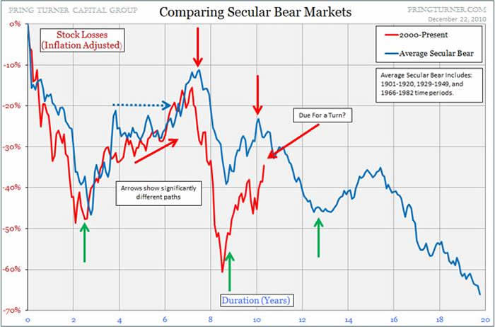 |
The structure of the 1966-1975 bear market is what I am interested it. From the end of Cycle Degree 3 of the last bull market, this bear market begins with an expanded flat that runs from 1966-1970. The next X wave runs from 1970-1973. The last sharp leg down is very fast running from 1973 to the end of 1974.
This pattern looks like an expanding triangle (has a megaphone shape) and has 5-leg structure that a triangle exhibits. I however don't believe in 'expanding patterns' and think that 99.9% they are a red herring. But however we label it (either an expanding triangle or a flat-X-zigzag) the point is this bear market made both higher highs and higher lows several times before ending. This was a meat grinder.
What is very interesting is that in the current market, the SPX also makes an expanded flat from 2000-2009. And the current sharp wave up (the current V-shaped 'recovery') closely resembles the start of the large X wave in 1970.
With those observations, I wanted to put together a side-by-side comparison.
Now, there are some HUGE caveats that go into this comparison, and you must be mindful of them.
1) There is **NOT** time equality in this comparison. What this means is that I have adjusted the time scales of the two waves to match up peaks, rallies and declines. This is a wave pattern comparison. The wave from 1966-1975 was a Cycle Degree wave, and the current bear market is (my contention) at the SuperCycle degree. As such, if the pattern presented at Cycle 4 from 1966-1975 plays out in this bear market from 2000-20(18-20?) the peaks do not line up in time.
2) The are some major differences in macroeconmics between now and then. The 1970s were characterized by large inflation that was increasing and massive oil shocks. Largely since 2000 (and actually into the 1980s) the trend has been disinflation. Reporting of inflation via the CPI over the past 5 years or so has been suspect (rampant exploitation of hedonics and substitution - see: Regarding Economic Debates and Opinions: The Fallacy of "Purely Objective" Analysis) and I do think it is being underreported. And John Williams keeps alternate inflation statistics at ShadowStats (which I think are too high). Somewhere in the middle is what my opinion is. Also in 1971, Nixon closed the Gold window and we have been a completely fiat currency system since.
With that in mind, here is a look at the comparison chart that I put together:

Some observations:
-- Even scaled, the peaks do not exactly line up. Keep in mind, that is not the point of this comparison. But what is interesting is that the shape and relative severity of the waves are a pretty good match.
-- The shape of the rally since the low in 2009 is analogous to the shape of the rally in 1970. Not exactly (of course) but there is a good amount of correlation.
My main reason for showing this chart is to illustrate that the shape of the 1966-1975 market could be a precedent for the for the current secular bear market.
In this post I will be digging deeper into the 1966-1975 bear market
*** Moving Average 'Price Stretching'
This idea of Moving Average 'Price Stretching' comes from the idea of price 'snapping back', as if stretched by a rubber band.
In a bear market, price moves so fast on the down moves that it deviates significantly from longer term moving averages. I have been quantifying this 'stretching' by finding the percentage difference between price and a long term moving average (In this post I am using 275 day SMA, which is a relevant MA in a trend finding / following system I have been developing the last few months).
On the down moves, the price stretching reaches an extreme and then the price snaps back. There is not a single threshold value, but what is interesting in the 1966-1975 bear market is that there is proportionality / trending of the 'stretches' on each lower low in the series.
And this jives with empirical observations: We see utter fear at market bottoms. Very often this occurs as indicators are showing divergence in the move. The move gets exhausted and we have a (often sharp) reversal.
I wanted next to look at the bear market rallies (the cyclical bull markets) in the larger secular bear from 1966-1975. I wanted to see if there was any 'price stretching' there too.
And it turns out there is... sort of. The bear market rally starts out very fast as reaction to the previous (usually oversold) down trend. The market rallies above the long term MA, reaches a momentum zenith and then stalls. But it doesn't fall back significantly. The mid cyclical rally corrections were on the order of 15-20%. Then there is a next leg up to the top of the rally that is markedly slower, with less momentum and more obvious corrections than the first leg of the cyclical rally.
The momentum and price stretching peaks in the first leg of the cyclical rally. After a relatively sideways / shallow correction, then there will be a peak in the momentum in the price stretching of the second rally. But that momentum and price stretching peak is well below the first peak.
So there is not only an obvious A-B-C in the price move, but there is also an obvious A-B-C in the price stretching.
The 1966-1975 Bear Market:

Next I wanted to see how the current secular bear market was shaping up. I showed above that the wave relationships and relative durations were similar. I wanted to see if there was a similar 'price stretching' dynamic for both the down legs and the up legs.
The two down legs (2000-2002 and 2007-2009) are very similar in structure, momentum and price stretching to the down legs of the 1966-1975 bear.
What is very interesting is the 2002-2007 cyclical bull market. As I showed above in reference #3, there is an A-B-C wave structure to the overall move. However it is not as obvious as the wave structure in the cyclical bulls from 1966-1975. The B wave is more of a running flat, not a clear retracing wave.
But when you look at it from a price stretching perspective, there is a clear corollary between the 2002-2007 wave and the 1966-1975 bear market rallies. There is a clear momentum peak in the A leg. Then a period of contraction where the price is near the long term MA around the B leg. Then a final acceleration in the C leg that makes a clear lower low when compared to the A leg momentum peak.
Just as interesting is that that the current rally from the 2009 low is shaping up in a similar fashion.
The (obvious) disclaimer: Even if this is a valid prototype for our market, there is very little chance it will play out exactly the same way (and I even show above, the previous peaks and rallies don't precisely line up on a scale comparison). If this is a valid prototype, I would think that it shows a loose representation as to what the overall wave structure might look like. This is NOT (nor am I suggesting it to be) a timing device of any sort
The 2000-20xx Bear Market:


